Flutter Design Challenge #1 - Product Page
Let's transform a beautiful product page in Flutter from mock-up design to implementation.

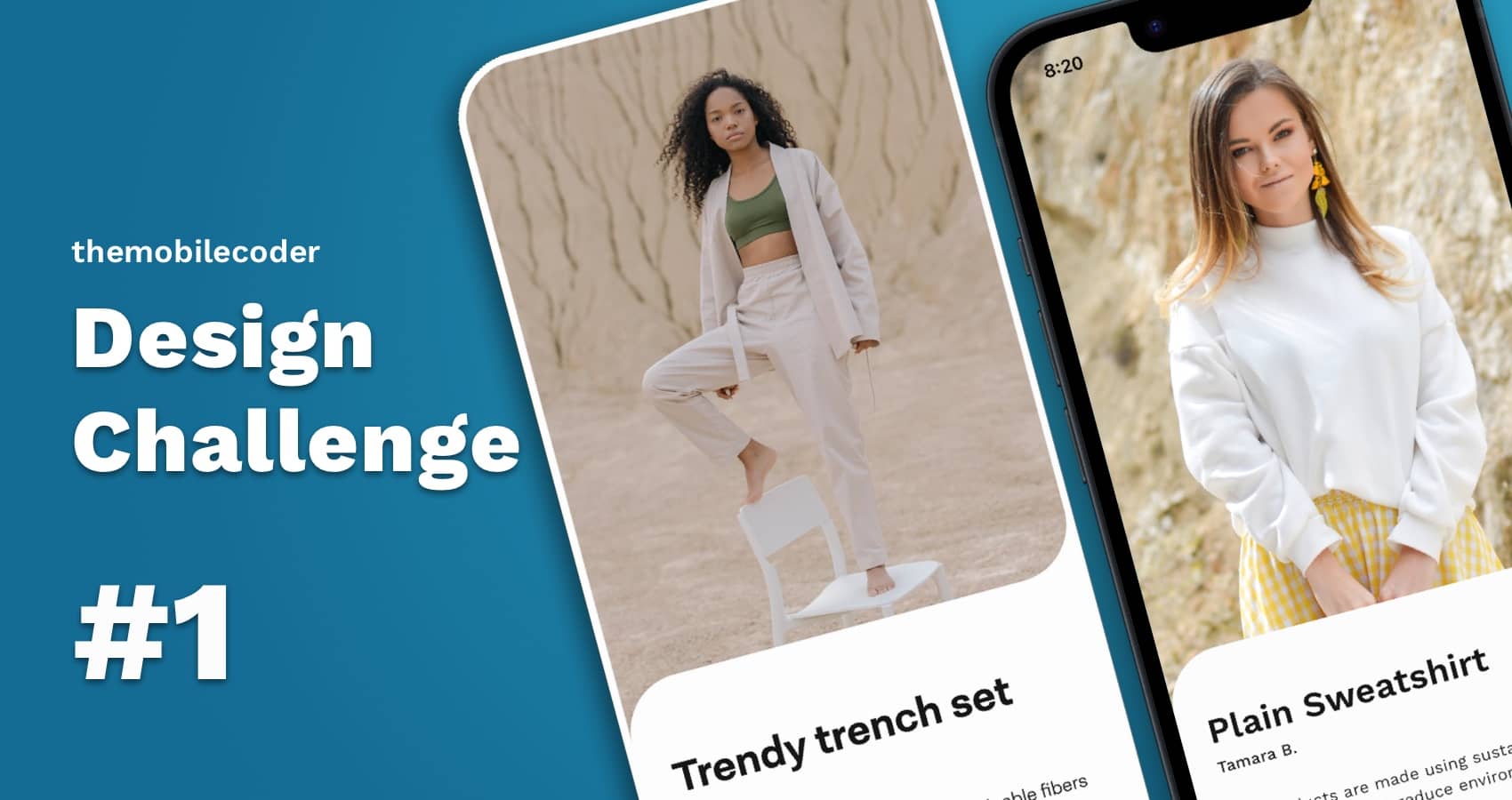
Welcome to the first Flutter design challenge of themobilecoder. Here, we find a beautiful design and try to write it up and implement it into an app.
The goal of design challenges is not to implement the full product itself, but instead make up the design in Flutter so everyone including me can learn and apply the learnings in our own apps.
The design
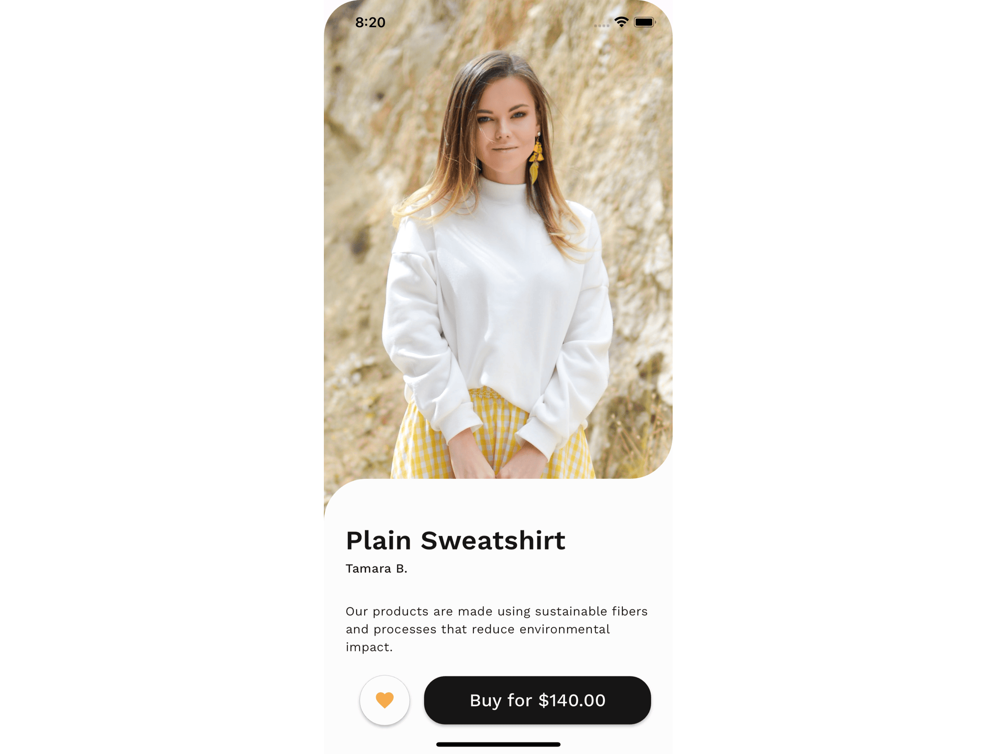
For our first design challenge, we will implement a simple shopping page that contains a photo of the product, a favourite button, and a buy button. I found a great mock-up in Dribbble to illustrate this concept.
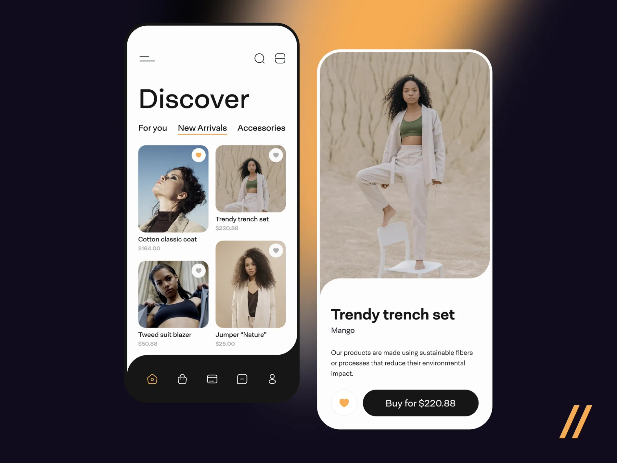
For our app, I will use a different photo and change a few bits in the content to make it a little more original.
App outcome
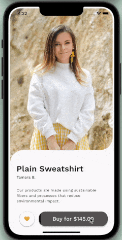
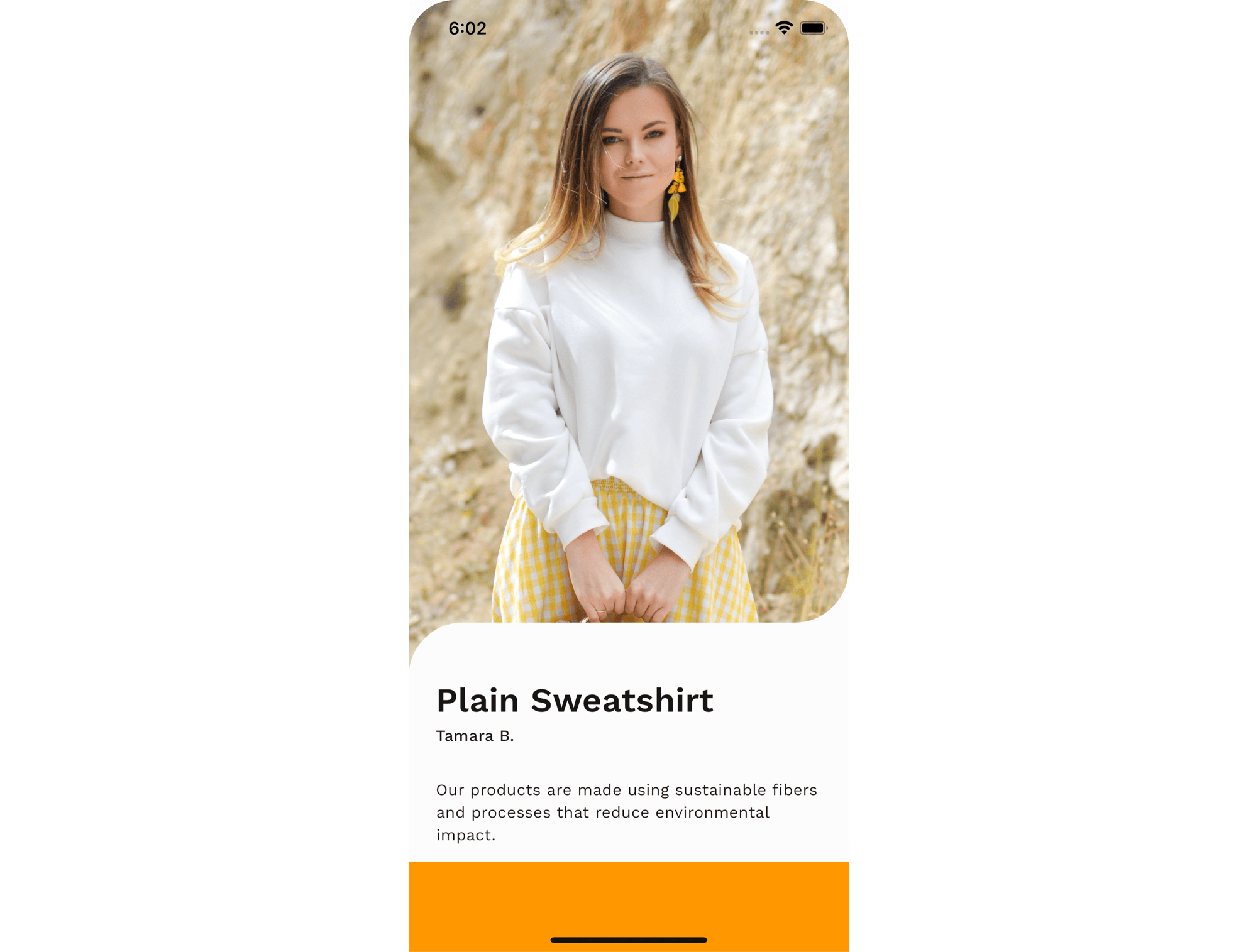
After writing up the code for our challenge, here's what it looks like.
Resources
Let's start by defining the resources that we need for this challenge.
1. Colour Palette
The colours we used in this project are the following:
- Orange -
Color(0xFFF6AB53) - Black -
Color(0xFF161616) - White -
Color(0xFFFCFCFC)
2. Image
The photo we will be using is from Unsplash by Tamara Bellis.
3. Font
The font used from Dribbble is Neogrotesk Pro but since it requires a license to use, I chose a font that looks similar called WorkSans
4. Simulator
I will use an iPhone 14 simulator in this challenge, so all the padding dimensions will be appropriate for this phone's size.
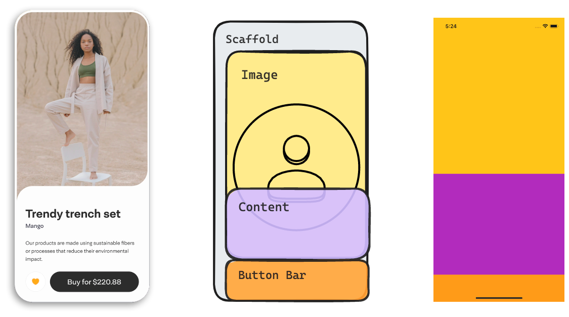
Screen layout
Let's determine the different parts of this screen and how they are arranged. We have a full-screen photo behind a content box. This content box is on the same plane as the bottom bar which contains two buttons: the favourite button and the buy button.
Now that we have defined the main components of this screen, we can do a quick implementation to demonstrate this arrangement.
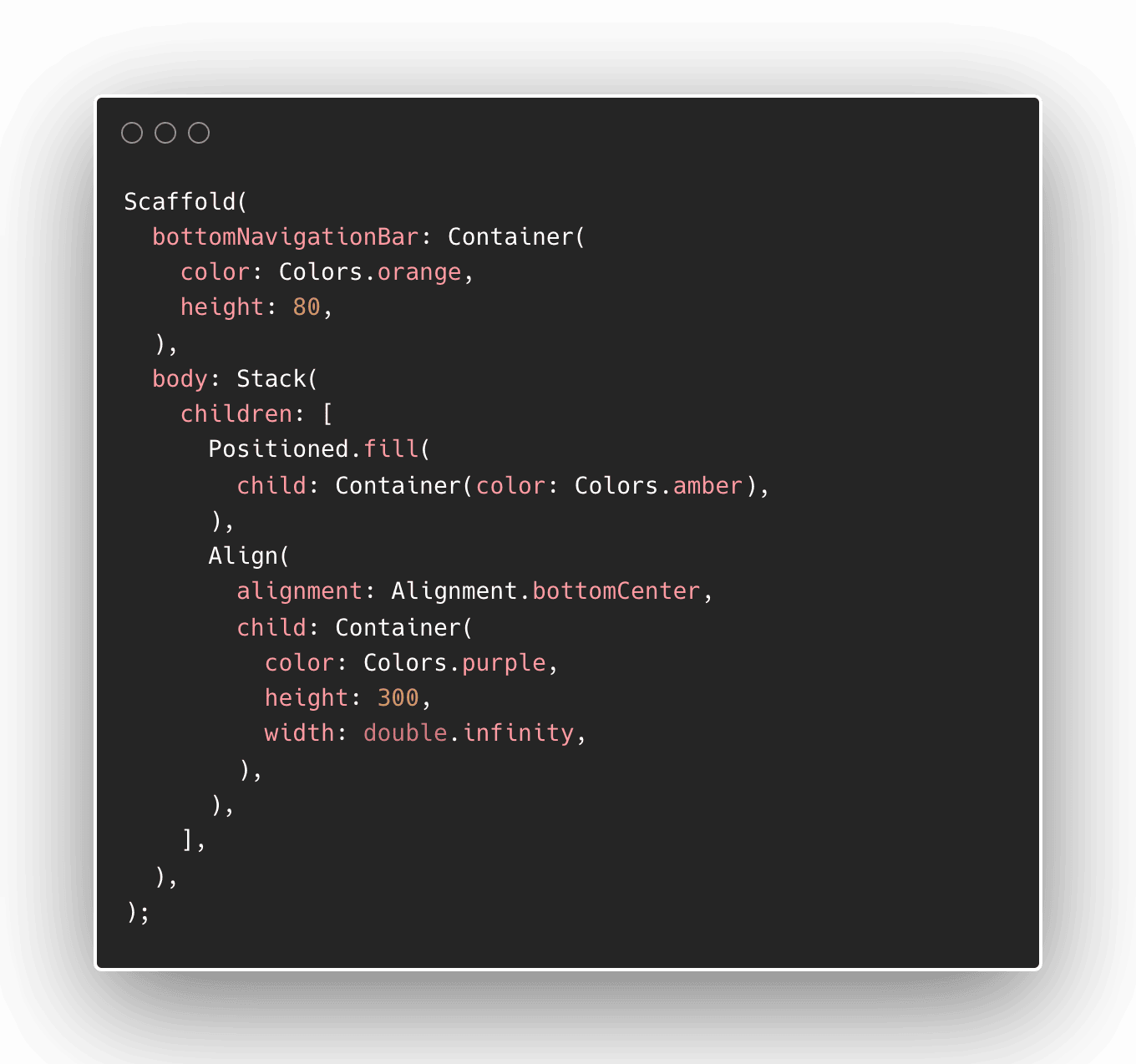
I use a Scaffold widget to contain the components on this screen. I will use the scaffold's bottomNavigationBar property to contain the buttons bar widget. Scaffold also has a body property that contains the main content. For the body, we will use a Stack widget to contain two widgets: the image and the content container. We use a stack so we can put elements on top of each other.
Now it's time to replace each component with the right widgets.
Implementing the image widget
For the primary image, we will use an Image.asset() widget. This is the best option for static images that are already included in the asset directory of your project.
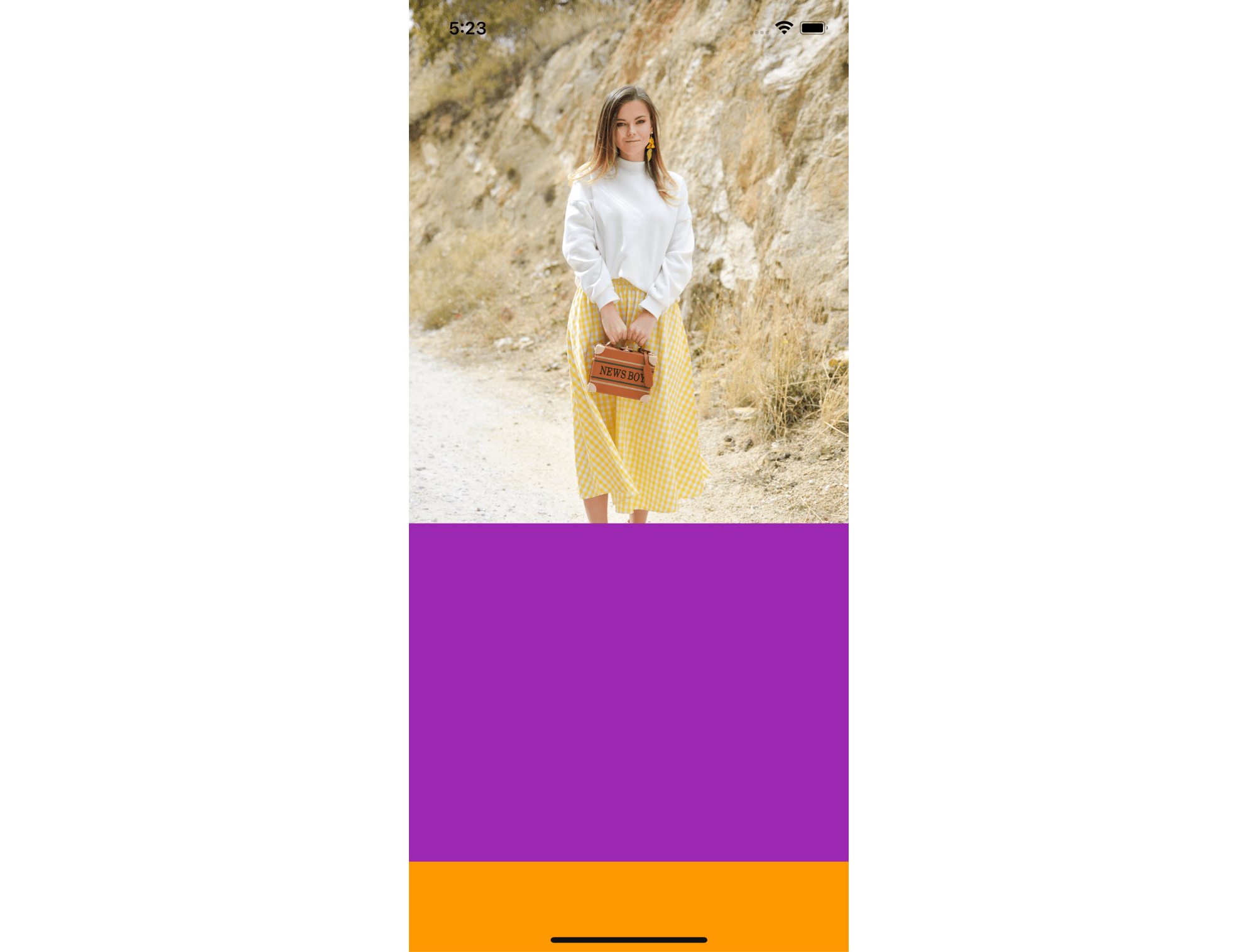
Transform the image
That image seems a bit small, so we can transform its size and position it accordingly. To do this, wrap the Image.asset() with a Transform widget.
To increase the size, we can use a Transform.scale() and set the scale accordingly. To adjust the position of the image, we can use the Transform.transalate() and move the image vertically so we can see the clothes we are selling clearly.
I used scale = 2.2 and imageOffset = Offset(x = 0, y = 340) to achieve my desired outcome for an iPhone 14 screen.
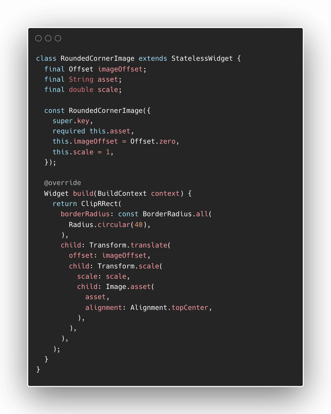
The last thing to note is that the edges of the image should be rounded. Let's trim the corners to be rounded by using the ClipRRect widget, which stands for ClipRoundedRectangle.
After doing these changes, we can make a reusable widget that accepts a scale, position offset, and the source image to use as parameters. I will name this RoundedCornerImage.
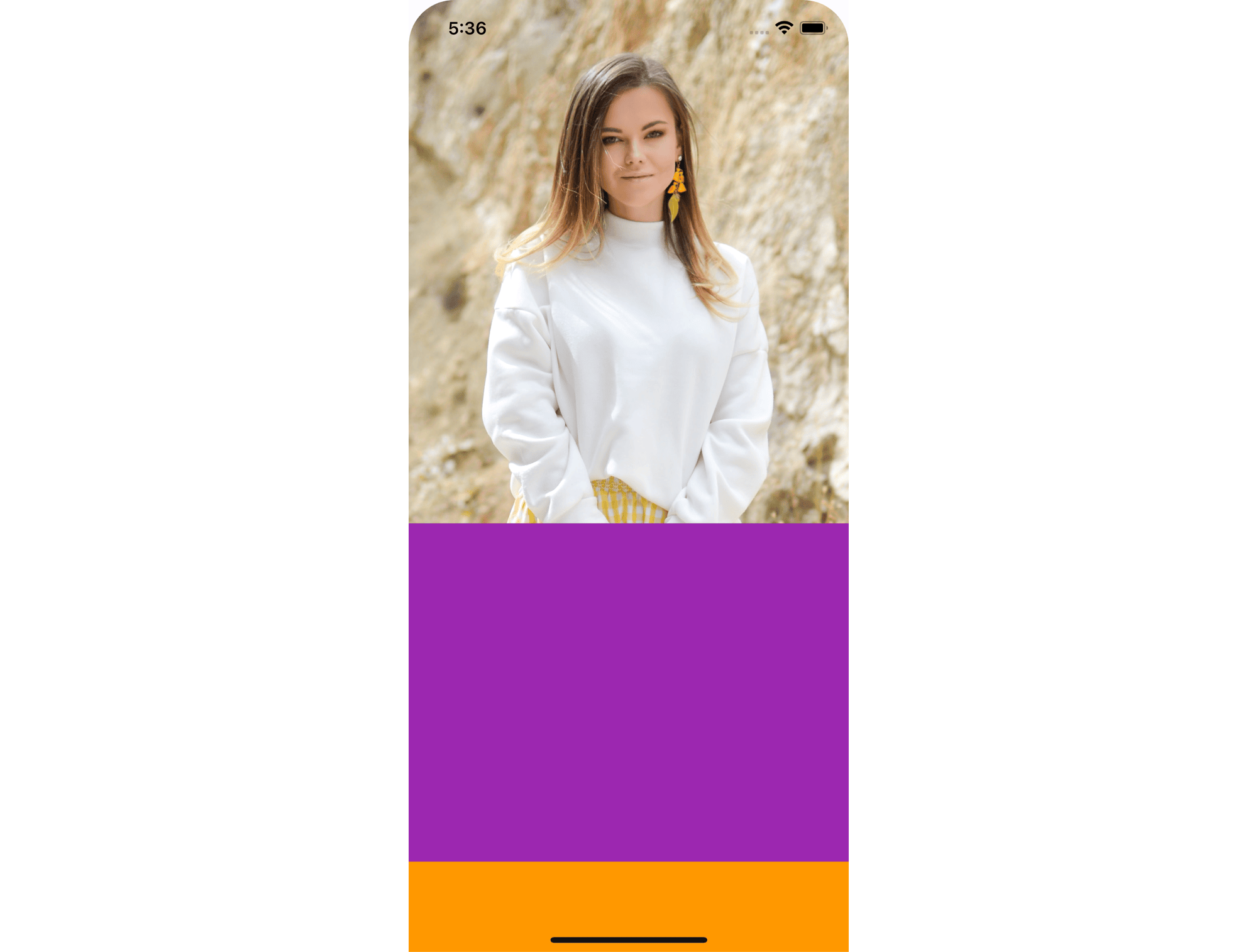
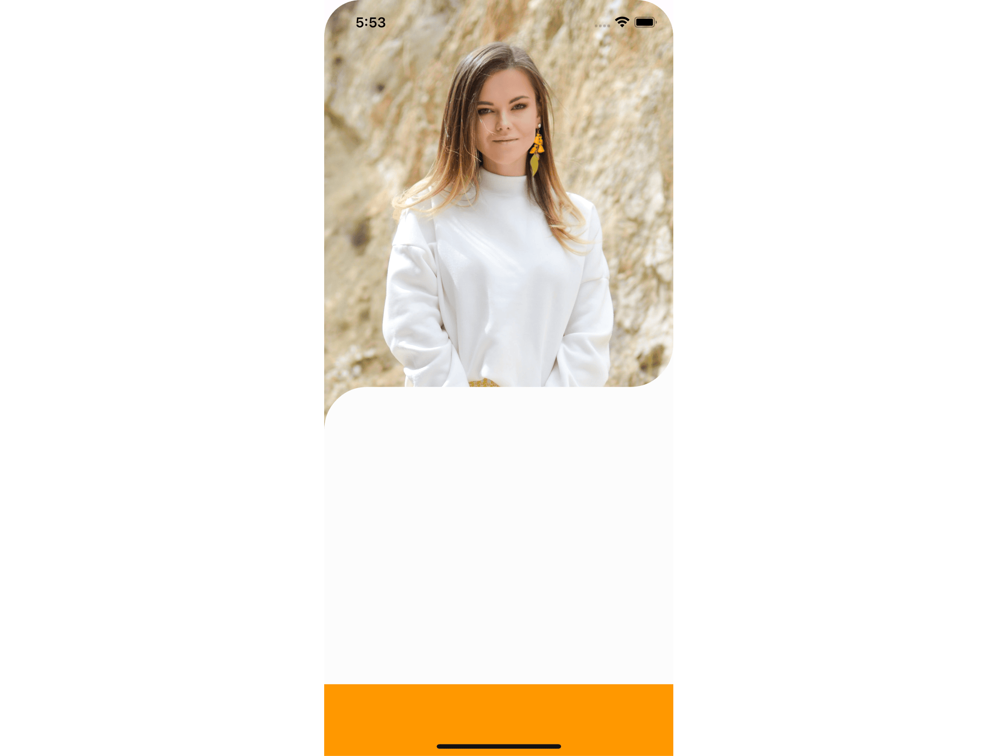
After updating the main_screen.dart with the new widget we created, the screen should be updated with a bigger photo that highlights the product better.
Implementing the product content
The product content is the white container that contains the product name, brand, and description. Writing code for this would have been a simple Container, but because of the curves found on the top left and top right corners, we cannot simply use a container.
Using the ClipPath widget
One approach to do these curved corners is to use the ClipPath widget and write our own CustomClipper<Path>. Check out the official tutorial for ClipPaths but for a simple explanation, the custom clipper should draw a rectangle base, with the top left curved clockwise, and the top right curved counter-clockwise.
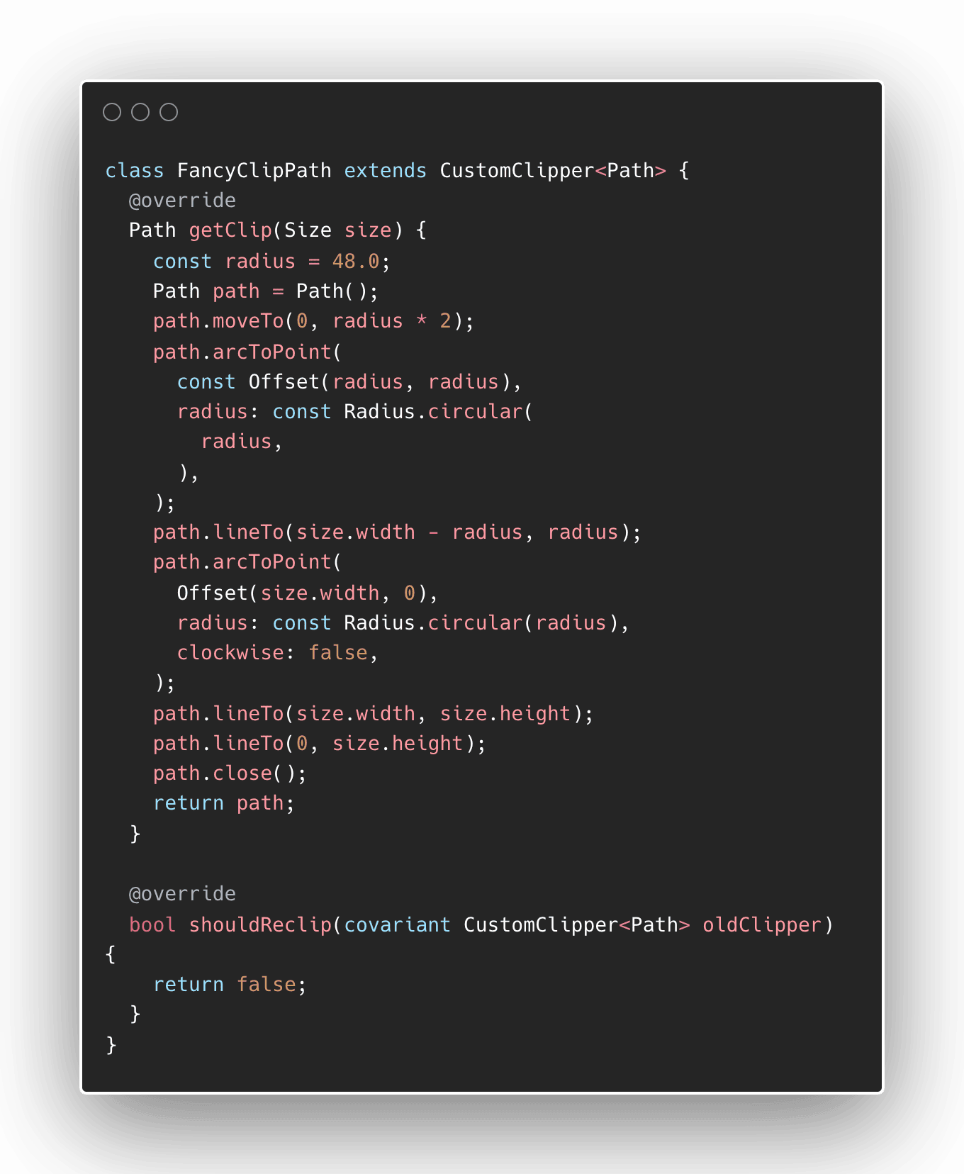
The next thing to do is to create a Container that has a minimum and maximum height and can contain a widget (Column of texts) that describes our product. Let's make this a reusable widget too and name it CurvedCornerContainer.
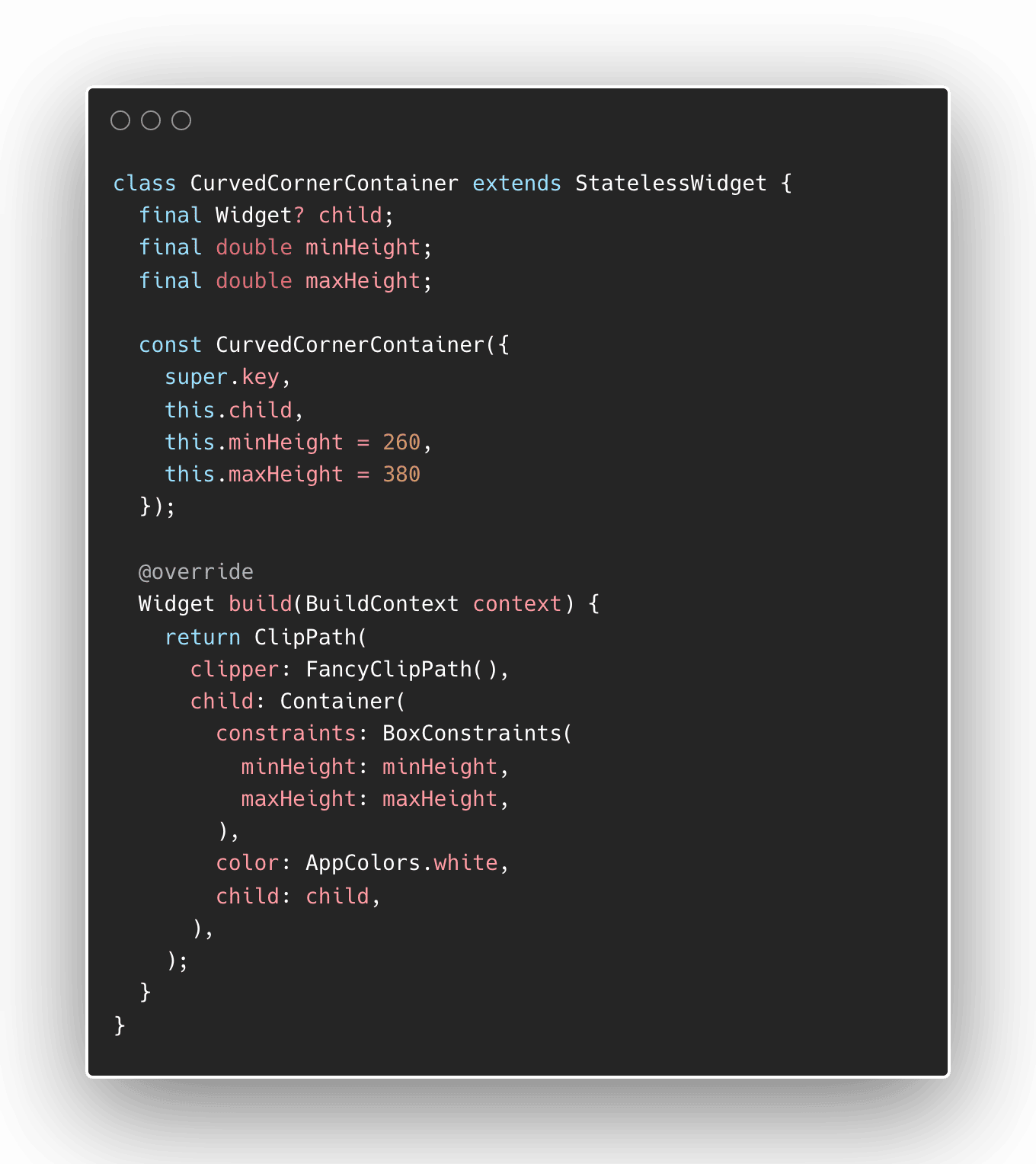
Once we replace the purple box with this container, it should show a white box with our fancy corners on top.
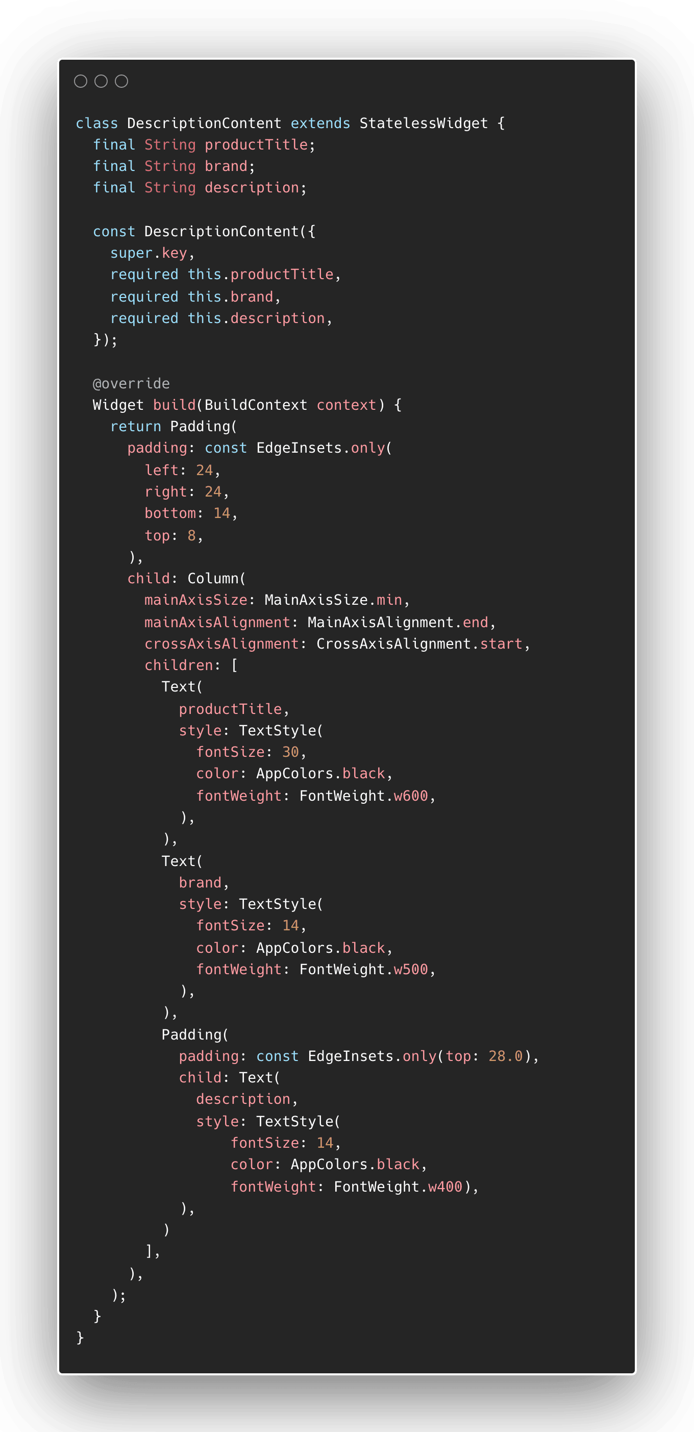
Adding the description content
The content can be a simple Column with three Text widgets as its children. The important part here is the different text styles used for each text. As we have included the necessary font in this project (WorkSans), it is just a matter of using different fontWeight , fontSize , and paddings in between.
Check out this Column tutorial to know more about its properties.
 Rafael Delos Santos
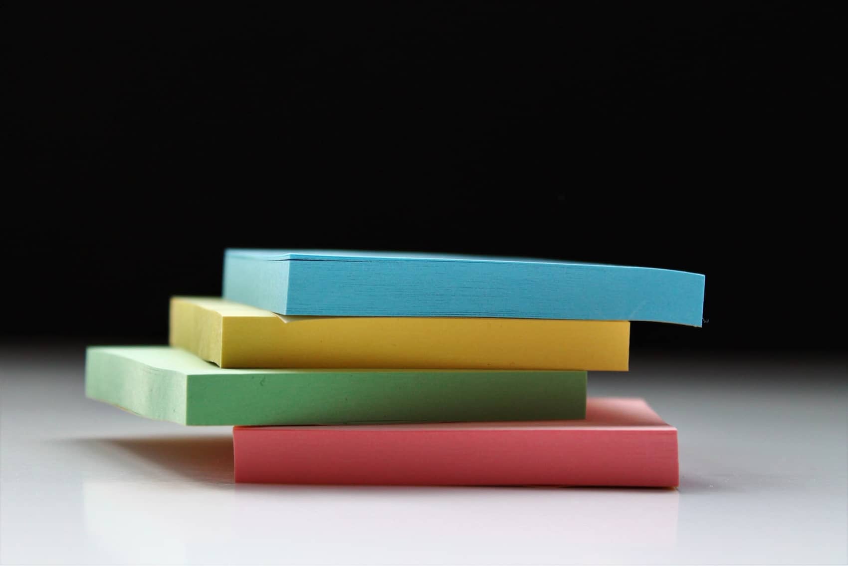
After writing the code for this, we can make this a reusable widget and call it DescriptionContent which accepts a product title, brand, and description.
We should now use this widget and put this as a child of the CurvedCornerContainer that we just wrote. The screen should look much closer to our chosen design!
Implementing the buttons bar
The last component that we will write is the buttons bar. It contains two buttons laid out vertically, so we will use a Row.
Rafael Delos Santos
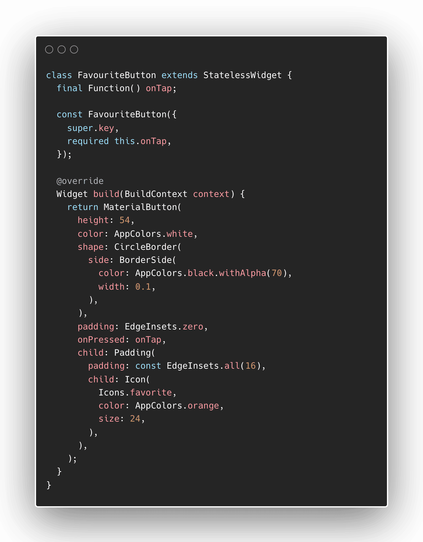
Favourite button
The favourite button is implemented using a MaterialButton. To replicate the button in the design, we have to set the shape property of the button to CircleBorder which has a grey border with a very thin width.
For the icon itself, we use an Icon widget that uses the Icons.favorite as the image. To make this image smaller, use Padding to push the image into a smaller size.
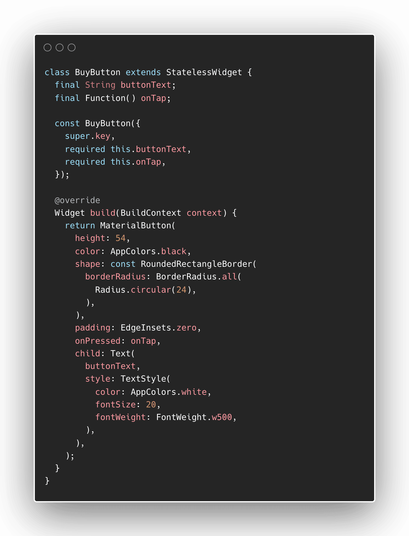
Buy button
The same thing will be used for the BuyButton. We use a MaterialButton to wrap a Text widget. In order to get the desired shape, we use a RoundedRectangleBorder as the shape property of the MaterialButton.
We also need to make sure that the button colour is black and the text should be white.
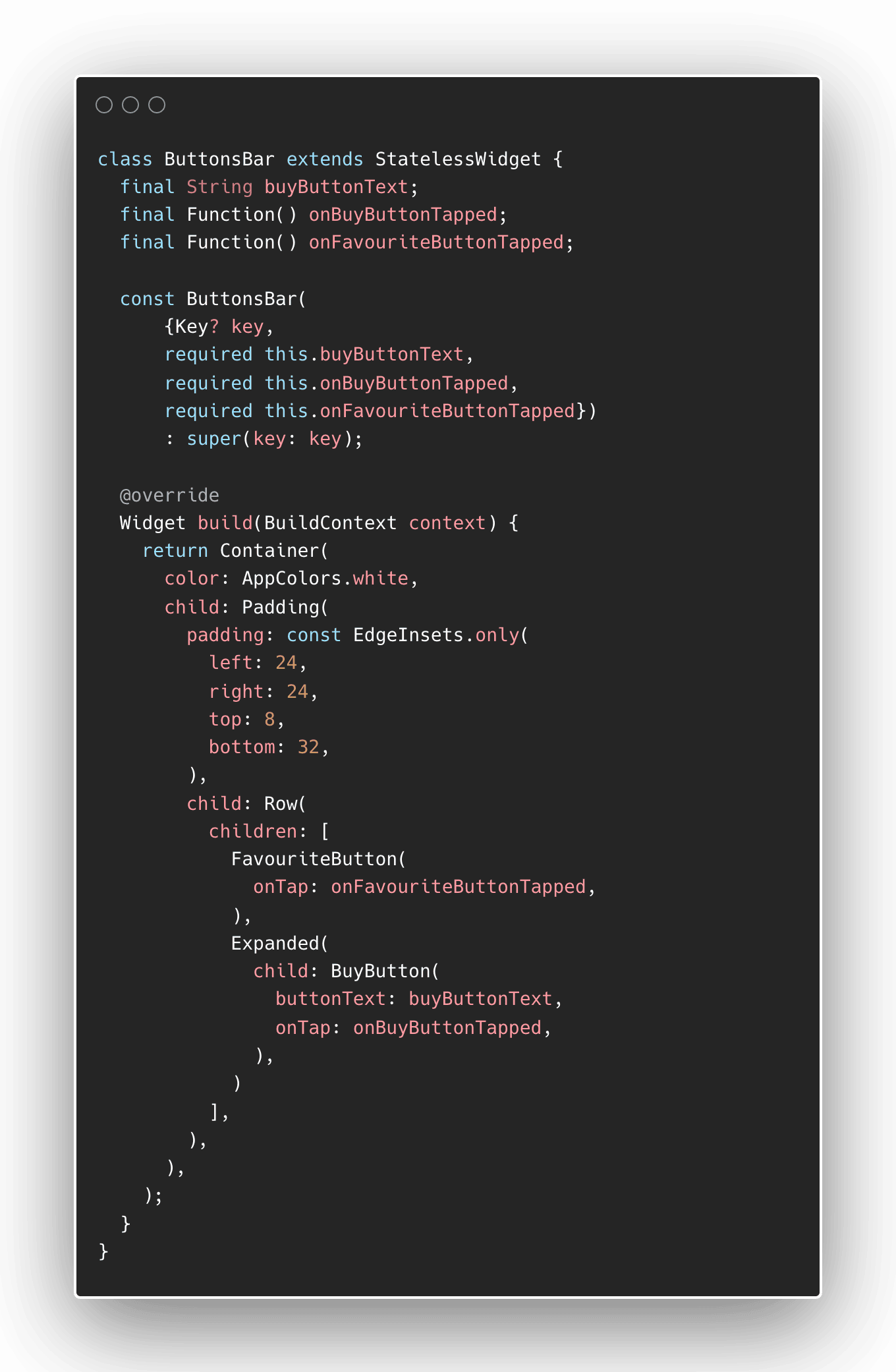
Buttons bar implementation
As mentioned before, the buttons bar will be implemented using a Row widget to hold the buttons horizontally.
One thing to note here is that the BuyButton fills up the remaining space next to the FavouriteButton. To do this behaviour, we need to wrap the BuyButton with an Expanded widget to fill up the remaining space in the Row.
We also need to put appropriate Padding so the sizes and spacings will look more natural.
Once we replace the Scaffold's bottomNavigationBar with the ButtonsBar widget, our app will look almost the same as our design inspiration.
White border outline
In the original design, there is a white outline along the border of the screen. We produce the same effect by adding a Padding to our Stack of widgets.
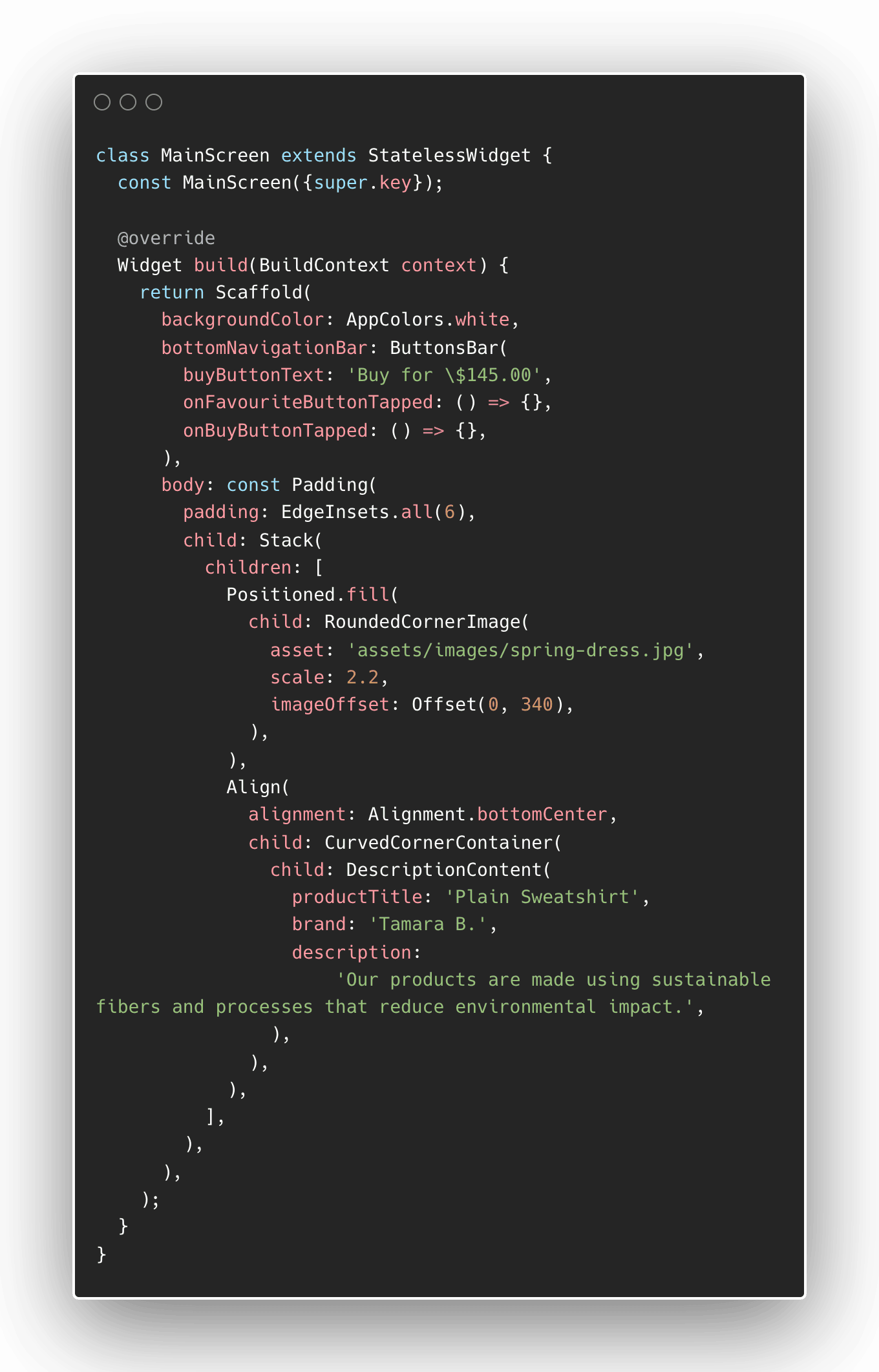
Main screen implementation
Once we have converted everything, our MainScreen widget should be complete. Mainly, it is a Scaffold that consists of a customised bottomNavigationBar and a Stack that consists of the product image and the content description.
Final result
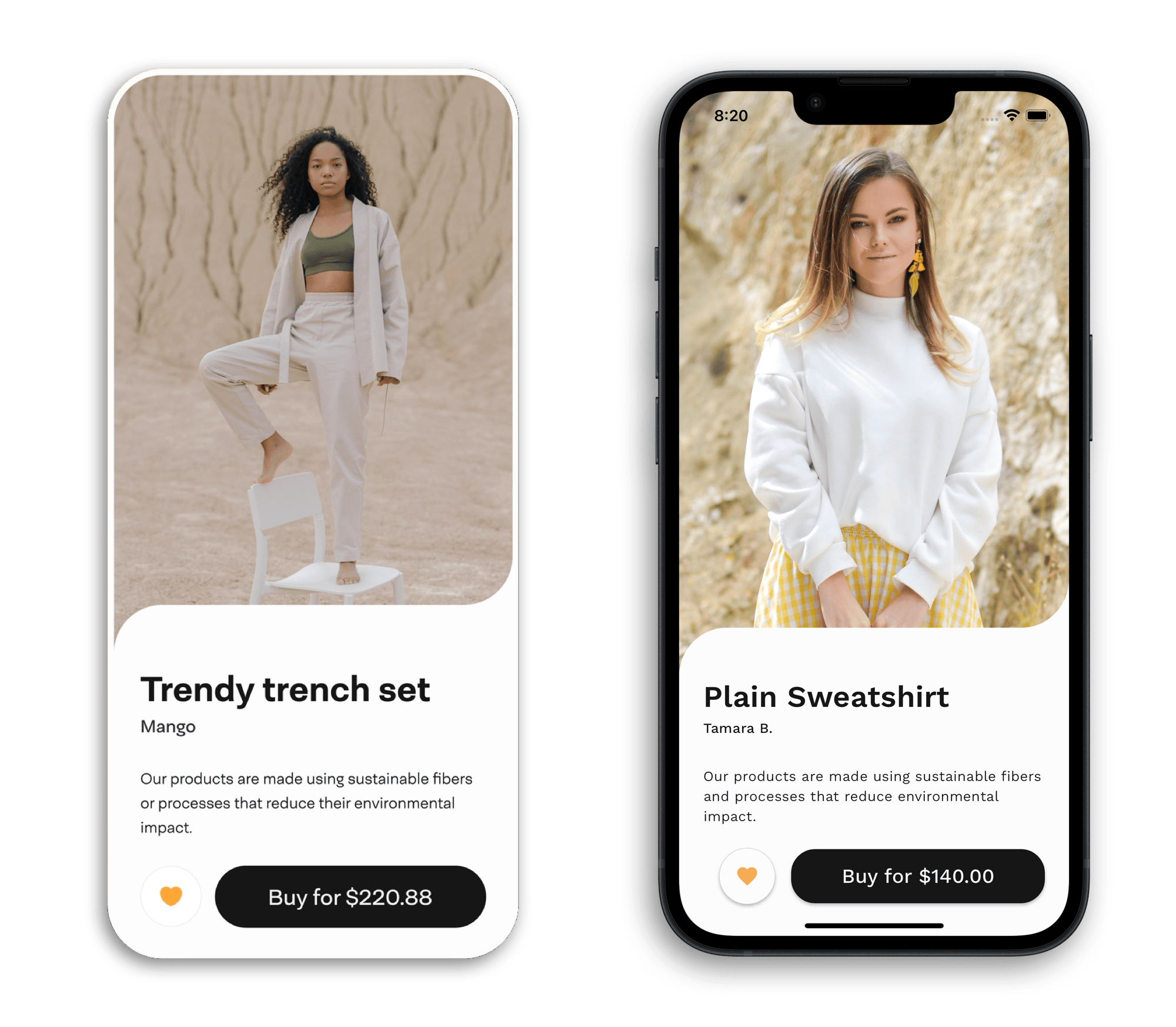
This side-by-side comparison tells us that our design challenge was a success! This product page was implemented without using external libraries and was built using widgets included in the Flutter library.
Further improvements
As you get more experienced with Flutter, you will learn that hard-coded values do not work in a real-world setting. While the values that we use in this project worked on an iPhone 14 device, this will not look as good in an iPhone SE, or worse, on a tablet.
These considerations are out of scope for this design challenge but are something to keep in mind when developing real apps.