Axis alignment of Columns and Rows in Flutter
Understand the basic properties of Flutter Columns and Rows to arrange the alignment of their child widgets.

There are different ways to align widgets within a Column and a Row. Both widgets share similar properties, yet each differs based on their axes. In this tutorial, we will see the effects of applying different types of alignments to both Column and Row.
Column and Row refresher
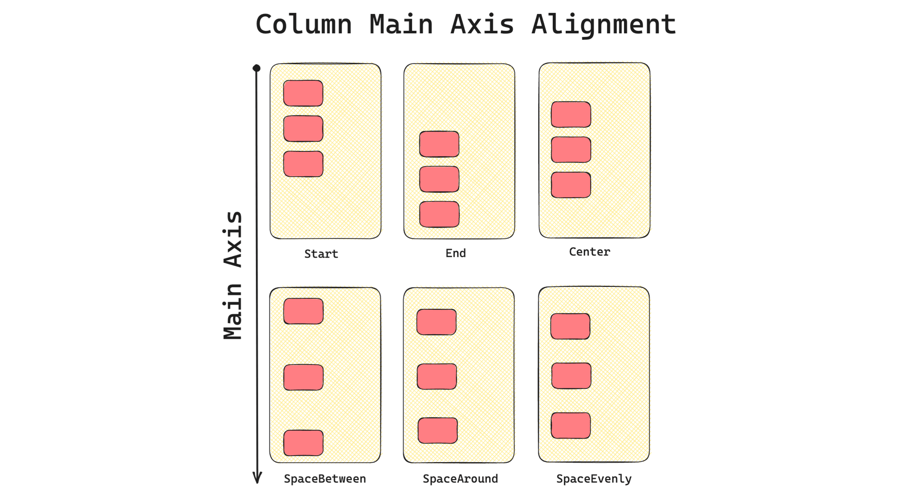
A Column widget arranges its child widgets vertically, therefore defining its main axis as the Y-Axis. A Row on the other hand does it horizontally, which means that its main axis is the X-Axis. It is important to keep this in mind so we know which properties we should change to achieve a certain result.
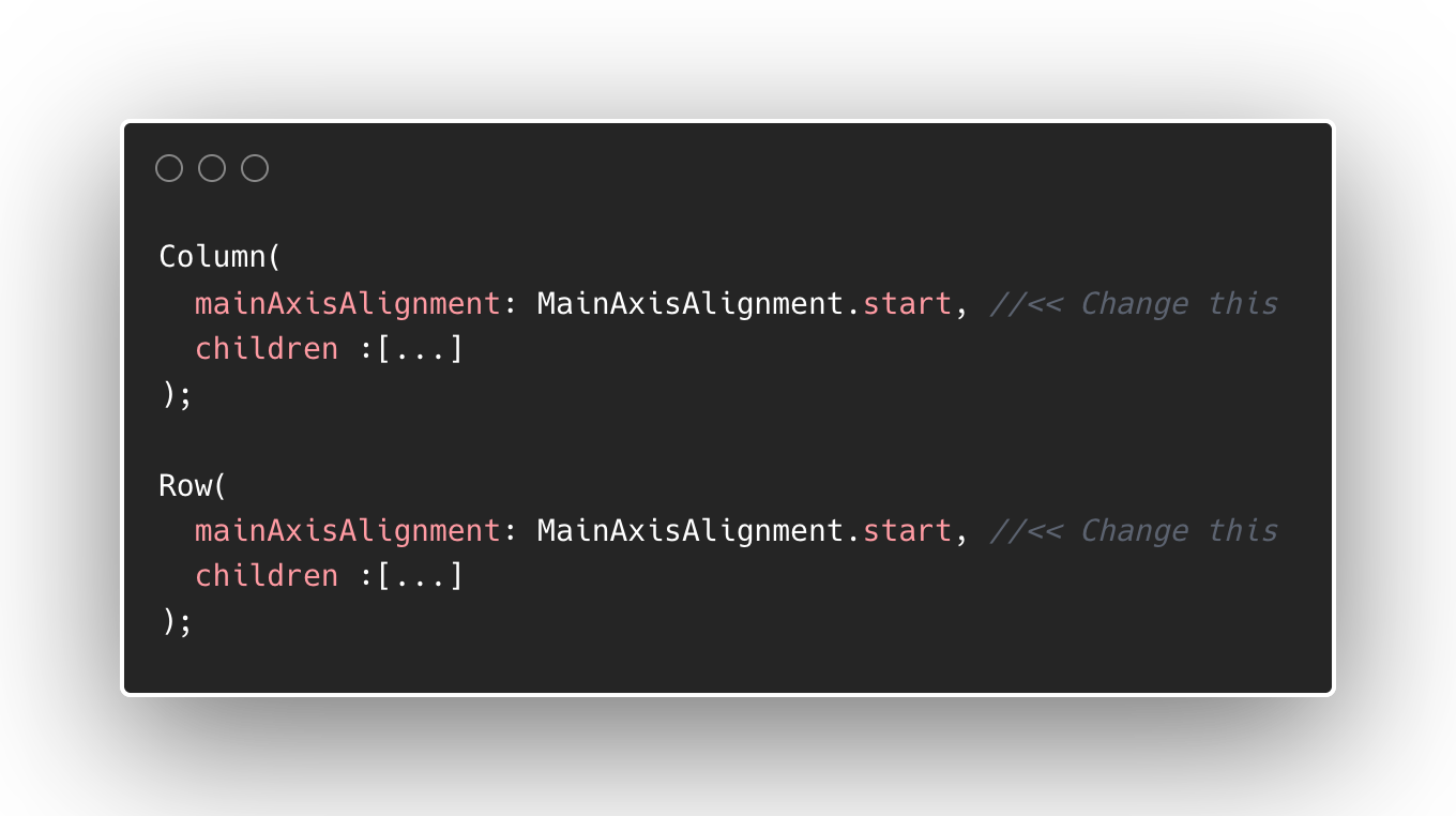
Arranging the child widgets using mainAxisAlignment
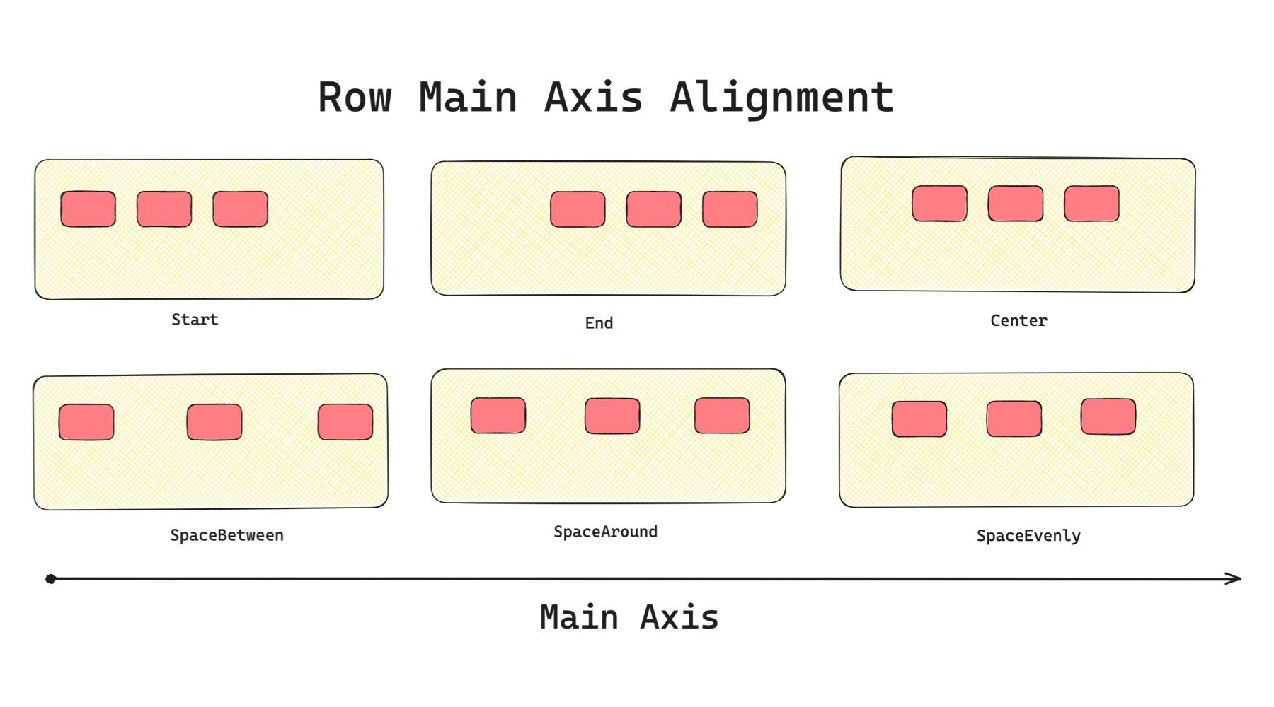
The mainAxisAlignment modifies how the widgets are arranged vertically in a Column and horizontally in a Row. Changing this property affects either the position of the widgets along the main axis or the spacing between the child widgets.
Look at the following illustrations to learn how each type of main axis alignment affects a Column.
And now for a Row, changing the mainAxisAlignment arranges the child widgets like in the image below.
For reference, the mainAxisAlignment properties are:
- start: Move the widgets to the top for a
Column, left for aRow - end: Move the widgets to the bottom for a
Column, right for aRow - center: Layout the widgets to the centre
- spaceBetween: Arrange the widgets with even spaces between them
- spaceAround: Arrange widgets with even spaces between each widget, with half of that space above the top widget and below the bottom widget
- spaceEvenly: Arrange the widgets with equal spaces on both the top and bottom of each widget
What about crossAxisAlignment?
The crossAxisAlignment property arranges the widget opposite of the main axis called the cross axis.
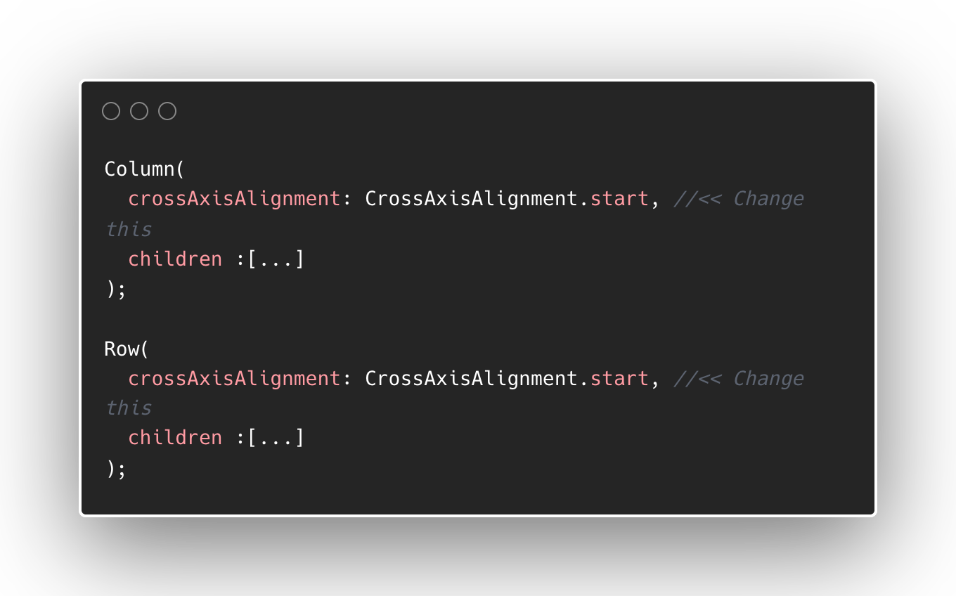
Have a look at the different crossAxisAlignment values and how child widgets would look inside a Column.
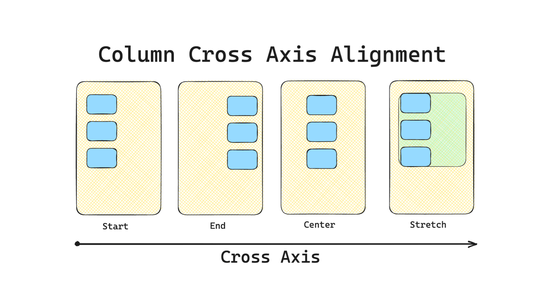
For crossAxisAlignment in a Row, the child widget arrangement will be along the vertical axis.
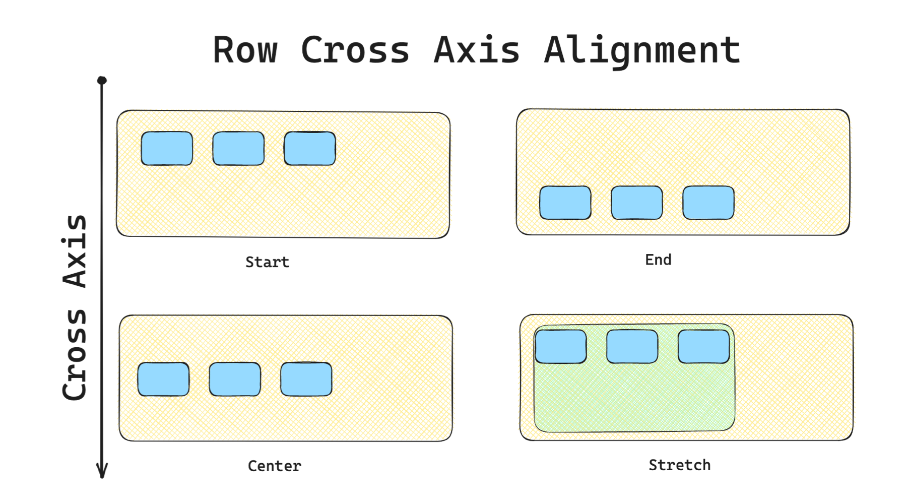
For reference, here are the crossAxisAlignment values:
- start: Move the widgets to the top for a
Row, left for aColumn - end: Move the widgets to the bottom for a
Row, right for aColumn - center: Layout the widgets to the centre of the cross axis
- stretch: Fills up all available extending along the cross axis
- baseline: Move the children along the cross-axis such that their baselines match. It will only work if child widgets have baseline properties
Row or Column does not have a constrained width e.g. parent widgets are Row or Column as well.Summary
The mainAxisAlignment and crossAxisAlignment are the main properties to arrange the child widgets of Columns and Rows. Just remember that Column has a vertical main axis and Row has a horizontal main axis. The layouts' cross axes will be the opposite of their main axes.
