Columns in Flutter - Arrange Flutter widgets vertically
Learn the basics of using a Column in Flutter to arrange the layout of your content vertically.

One of the key aspects of creating a beautiful user interface is to learn how to use the fundamental widgets of Flutter. The Column widget is one of the most used widgets to arrange the layout of your components.
What is a Column?
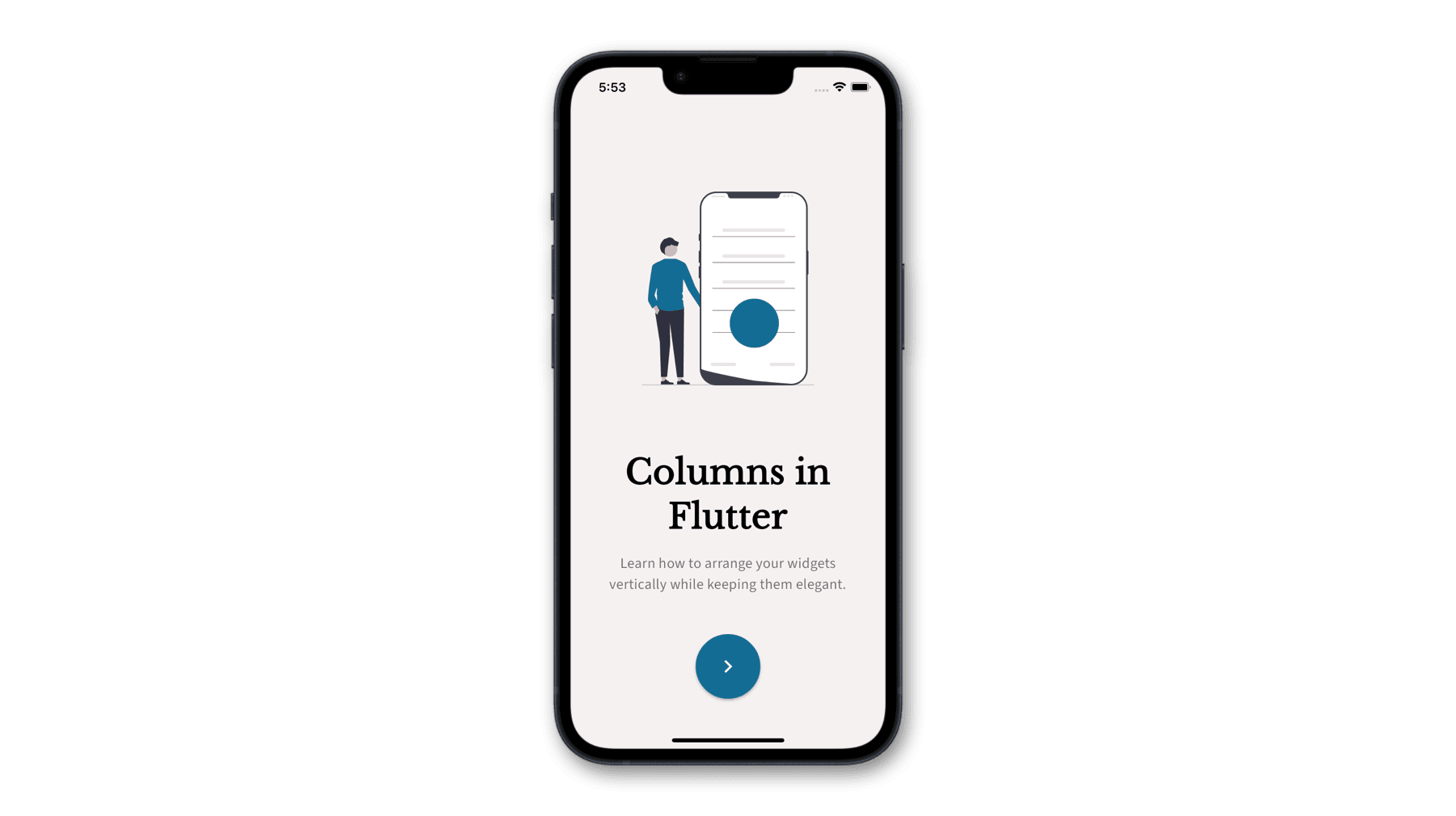
The Column is a fundamental layout widget that allows you to arrange child widgets vertically. If you want to set the order of widgets from top to bottom or the other way around, Column is the widget you need.
For horizontal arrangements, see Row layout widget.

Implementing a Column
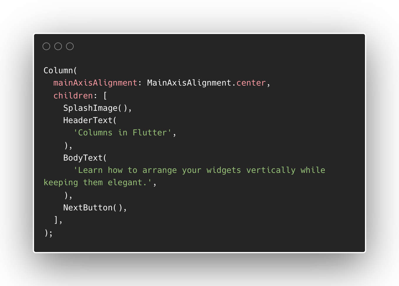
The most important parameter when using a Column is the children property which accepts a list of child widgets to arrange vertically.
Column properties
On top of the required children parameter, there are other useful properties to keep in mind when using a Column.
Axis Alignment
The mainAxisAlignment property handles the arrangement of the child widgets along the vertical space. Types of arrangement include start, end, center, spaceAround, spaceEvenly and spaceBetween.
On the opposite axis, the crossAxisAlignment property handles the arrangement of child widgets along the horizontal space. Values of this type are start, end, center, stretch, and baseline.

Vertical Size
By default, Columns stretch vertically as permitted by its parent widget. However, you can override this to only expand according to child widgets' sizes vertically by setting the mainAxisSize to MainAxisSize.min
Direction
The last property of a Column is the verticalDirection. This defines whether the widgets should start from top to bottom, or bottom to top.
When to use Columns
The expected use of Columns is to group static widgets vertically. For example, you are designing a card widget that has a title text and a subtitle text. While you can implement this arrangement using other layout widgets such as Stack, it is more straightforward and clear to do so with Columns.
It is important to define your use case when using Columns to avoid unnecessary problems.
Issues with Columns
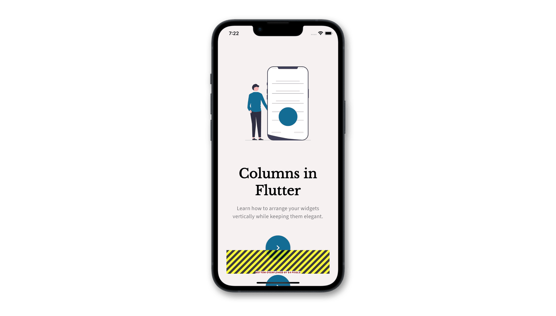
If you have been writing Flutter apps, you have probably encountered an issue where your Column has increased in size to the point where it overflows out of its parent widget.
An issue with Columns is that it is not scrollable by default. When widgets inside the Column grow bigger, overflow happens.
Solution 1: Use Expanded or Flexible
A solution for this issue is to use an Expanded or Flexible layout widget to wrap the big child widgets inside a Column. This makes the child widgets ready to overflow safely when their content is dynamic.
Solution 2: Use a ScrollView
Another way to make a Column scrollable is by wrapping it with a SingleChildScrollView or any widget that lets its child widgets scroll. But in most cases, it is much better to use Column to arrange related widgets vertically instead of making a scrollable screen from it.
Solution 3: Use a ListView
If you are planning to make a screen that is scrollable with dynamic content, check out ListView for displaying a list of similar widgets or better.
Summary
We just covered a short introduction to using columns in Flutter. It is important to keep the usage of columns to arrange cohesive widgets vertically. Finally, keep your content adaptable to size constraints by wrapping child widgets with Flexible or Expanded.

