How to use custom theme colours in Flutter without using Material or Cupertino Theme
Learn how to use customized color themes in Flutter with the color_theme_provider package.


It is important to think about how to add structured colour theming to your design when building Flutter apps. The most popular way to do so is to use the Material Design's ColorScheme class. The better approach is to use a design system that specifically works with your app's design system such as the color_theme_provider package.
Using the Material Design colour system
In many examples, you will always see the following code snippet wherein you can define the Material design colour scheme.
return MaterialApp(
  home: const HomeScreen(),
	theme: ThemeData(
		colorScheme: ColorScheme.fromSeed(
			seedColor: Colors.purple,
		)
	),
);
This is not a bad way to start your app with proper colour schemes. Whenever you use widgets that extend the Material widget, then their colour properties will adhere to this theme. However, the downside of this approach is it lacks the customisation that you might need in your application.
A more customisable approach to this is to create your own ColorScheme and define each property with the appropriate colour.
return MaterialApp(
  home: const HomeScreen(),
    theme: ThemeData(
    	colorScheme: ColorScheme(
    		brightness: brightness,
            primary: primary,
            onPrimary: onPrimary,
            secondary: secondary,
            onSecondary: onSecondary,
            error: error,
            onError: onError,
            background: background,
            onBackground: onBackground,
            surface: surface,
            onSurface: onSurface,
        ),
    ),
);
Once you defined the colours, you can start using these properties in your widgets by getting the ColorScheme from the context.
final colorScheme = Theme.of(context).colorScheme;
return Container(
	color: colorScheme.background,
);
The downside of using ColorScheme
The problem with using the Material design colour scheme is that we are restricted to using the following properties defined by this design system. If we are working with a team that has its design system, it might be difficult to match each property to a corresponding token.
Let's say in my app, I have the following design tokens:
- brandColor
- backgroundColor
- errorColor
- successColor
- textColor
I can use the ColorScheme to apply our design tokens to match the brandColor to primaryColor, backgroundColor to background, and so on with the errorColor. But what about successColor ? If I want to have a consistent colour theme across the app, then using the ColorScheme falls short. I will have to hard code the successColor somewhere in the app.
Using the color_theme_provider
One way to solve this issue is to use the color_theme_provider package. This package lets you define your colour scheme according to your requirements using the ColorTheme interface which can be accessed by any widgets in your application as long as these widgets are part of the ColorThemeProvider widget tree.
The color_theme_provider has the following features:
- Automatically changes the colour theme based on the system's mode (light or dark)
- Dynamically change the colour theme in runtime
- Does not depend on Material or Apple design tokens
Installation
You can install this using
flutter pub add color_theme_provider
or adding it directly to pubspec.yaml.
dependencies:
  color_theme_provider: 1.1.1
Defining the ColorTheme interface
Once the package has been imported into the project, we can start defining the colours that we need in our app. Let's use the colours that we defined above and make an interface that extends ColorTheme. Let's call it MyTheme.
import 'package:color_theme_provider/color_theme_provider.dart';
import 'package:flutter/material.dart';

abstract class MyTheme implements ColorTheme {
  Color get brandColor;
  Color get backgroundColor;
  Color get errorColor;
  Color get successColor;
  Color get textColor;
}
We are using an abstract class or an interface so that we can define a colour theme for light mode and another for dark mode. We can also define other colour themes if we want to have multiple colour themes in the app. The only requirement is that these classes should extend MyTheme.
final class LightMyTheme implements MyTheme {
  @override
  final Color brandColor = Colors.blue;

  @override
  final Color backgroundColor = Colors.white;

  @override
  final Color errorColor = Colors.red;

  @override
  final Color successColor = Colors.green;

  @override
  final Color textColor = Colors.black;
}
We can also define another theme for dark mode as such. In this example, we just changed the backgroundColor to a dark colour and its inverse for the textColor.
final class DarkMyTheme implements MyTheme {
  @override
  final Color brandColor = Colors.blue;

  @override
  final Color backgroundColor = Colors.black;

  @override
  final Color errorColor = Colors.red;

  @override
  final Color successColor = Colors.green;

  @override
  final Color textColor = Colors.white;
}
Wrapping your app with ColorThemeProvider
Once we have defined the themes, we can wrap our app with the ColorThemeProvider. This is necessary so that all the widgets under this widget tree can access the theme. If you have a top-level widget such as MaterialApp, then we can wrap this widget with ColorThemeProvider.
class MyApp extends StatelessWidget {
  const MyApp({super.key});
  @override
  Widget build(BuildContext context) {
    return ColorThemeProvider<MyTheme>(
      theme: LightMyTheme(),
      darkTheme: DarkMyTheme(),
      child: const MaterialApp(
        home: HomePage(),
      ),
    );
  }
}
Don't forget to define the generic MyTheme when using the ColorThemeProvider. All the widgets under the HomePage can access the MyTheme instance and apply the colours defined in there.
Applying the colour theme
Now that we have set up the app, we can start using these colours. We will need access to the widget's BuildContext to get the theme from the ColorThemeProvider.
The color_theme_provider has an extension function to get a colour theme instance. To get the colour theme, use the context.colorTheme<MyTheme>() extension function. Make sure to include the generic type of your theme. In our example, it's MyTheme.
class HomePage extends StatelessWidget {
  const HomePage({super.key});

  @override
  Widget build(BuildContext context) {
    final colorTheme = context.colorTheme<MyTheme>();
    //Using the colours
    colorTheme.backgroundColor;
    colorTheme.brandColor;
    colorTheme.successColor;
    // ..
Example of using the color theme
If we apply all these concepts, we can simply use these colours in our widgets. As an example, let's display the different colours from the theme. When using the colorTheme, we just need to define which colour property we want to use. The ColorThemeProvider takes care of applying these colours, whether it is in light or dark mode.
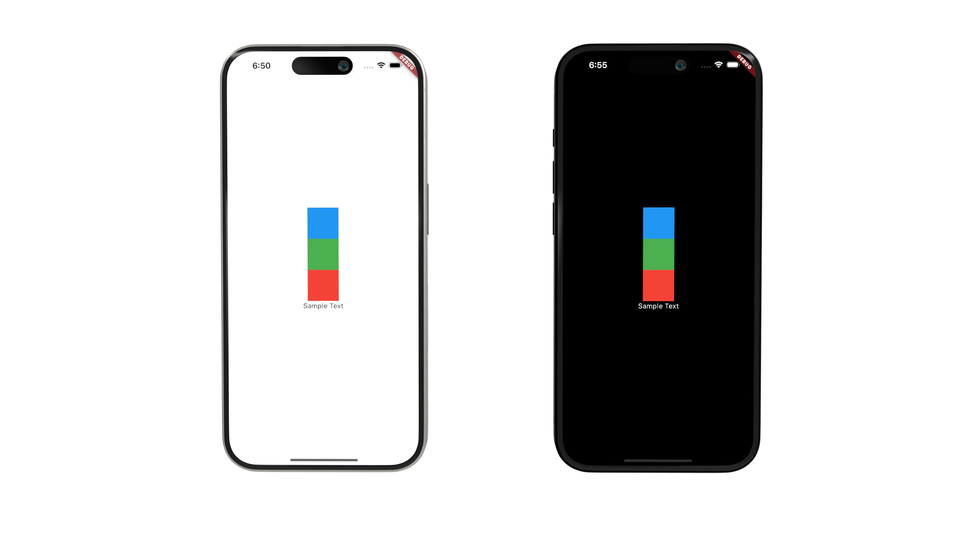
ColorThemeProvider for Light and Dark theme.class HomePage extends StatelessWidget {
const HomePage({super.key});
@override
Widget build(BuildContext context) {
final colorTheme = context.colorTheme<MyTheme>();
return Scaffold(
backgroundColor: colorTheme.backgroundColor,
body: Center(
child: Column(
mainAxisAlignment: MainAxisAlignment.center,
children: [
Container(
height: 64.0,
width: 64.0,
color: colorTheme.brandColor,
),
Container(
height: 64.0,
width: 64.0,
color: colorTheme.successColor,
),
Container(
height: 64.0,
width: 64.0,
color: colorTheme.errorColor,
),
Text(
'Sample Text',
style: TextStyle(color: colorTheme.textColor),
)
],
),
),
);
}
}
In the example above, we can see that the background and the text colours change according to the device's system settings.
Dynamically changing the theme
We can also change the theme whilst the app is running using the ColorThemeManager.
final colorThemeMananger = context.colorThemeManager<MyTheme>();
colorThemeMananger.setTheme(NewLightTheme());
colorThemeMananger.setDarkTheme(NewDarkTheme());
This is useful if your app offers multiple colour schemes to users.
Conclusion
The color_theme_provider package is an alternative approach to using colour themes. With this package, we are not restricted to using the Material design or Cupertino colour properties. We can easily define the colours that we need according to the app's requirements.
First, create an interface that extends ColorTheme. Then, define a light and dark mode extending the created theme. Once the themes have been defined, wrap your application with ColorThemeProvider. To access the theme, use context.themeColor<YourTheme>() and start applying the colours.
Finally, you can change the colour theme in runtime using the ColorThemeManager.